Visual identity for an electronic music curation label

A curation label, designed from the ground up
OMA is a curation label for electronic music, built around DJ sets and sounds chosen on behalf of the audience. Starting on Instagram and SoundCloud, with the long-term ambition of growing into a physical café and listening lounge. I designed the full identity: logomark, logotype, colour system, cover art templates, and the brand guidelines that hold it together across digital and physical applications.


I leave it to the chef
The name comes from omakase, the Japanese phrase meaning I leave it to the chef. That idea, trusting someone else's taste, became the brief for everything that followed. If the whole proposition is curation, the identity can't shout. It has to feel like the work of someone who knows what they're doing and doesn't need to prove it.

A vinyl groove and an espresso swirl, drawn as the same thing
The logomark grew out of two references the founders cared about: the groove of a vinyl record and the swirl on the surface of an espresso. I drew them as the same thing, a series of concentric, segmented circles radiating from a centre point, so the mark reads as either, depending on where you encounter it.


A music label that doesn't look like one
I didn't want OMA to look like other music labels. Most lean on loud type and high-contrast graphics. OMA goes the other way: warm stone neutrals against deep black, Galano Classic as the single typeface, and cover art built from texture and light rather than imagery. The whole system is designed to feel calm, not loud.

One template, infinite releases
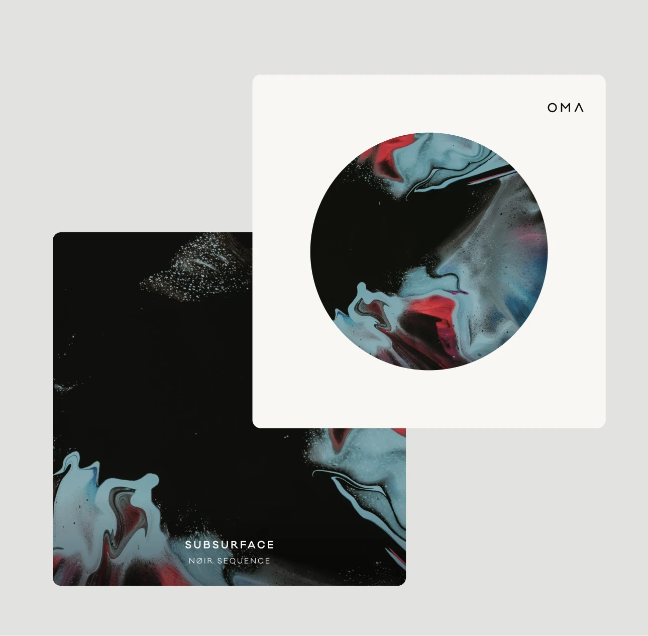
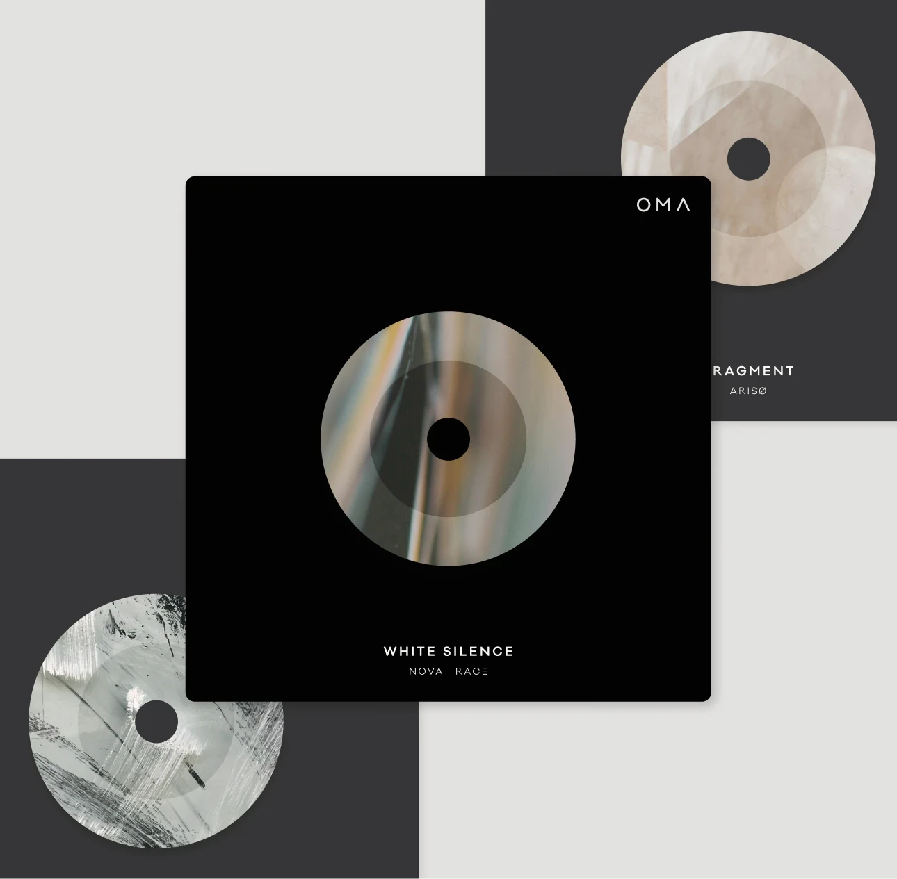
Each cover takes the swirl of the logomark and reinterprets it through photography and texture, chosen to reflect the music of the release. The result is a series of covers that feel connected without ever repeating themselves.
The template is also built to be used by the label owners directly, who aren't designers. A fixed logomark anchors each cover, and the series name, catalogue number, and artist sit in customisable type slots around it. They can release new music without needing me, and without the brand drifting visually over time.
The result is a brand that behaves like the curation it stands for. Confident enough to be quiet, specific enough to be recognisable.