Brand identity and product design for a business strategy card deck

A methodology, turned into a deck of cards
Linbits is the first card-based product built around the Lean Business Funnel framework. It's built around the Lean Business Funnel, a framework that brings the logic of lean and agile methodologies into the specific problem of sales and customer acquisition. Traditionally, this kind of work lives in a written marketing plan that nobody reads twice. Linbits replaces that with a deck of cards you can lay out on a table, combine, rearrange, and iterate on.
I was hired as the lead designer and owned the entire visual side: the brand identity, the deck of 152 cards, the packaging, and the launch content for social media.


Designing a system, not just a deck
The hardest part wasn't making the cards look good. It was making 152 of them work together as a system.
Each card represents one piece of a sales funnel: a channel, a tactic, a tool, a role, a metric. The user has to be able to pick them up, group them, and combine them like Lego pieces, without ever feeling lost in the deck. That meant every card needed to do three things at once: belong to a clear category, communicate its meaning in a glance, and fit visually with every other card around it.



Eleven families, one visual language
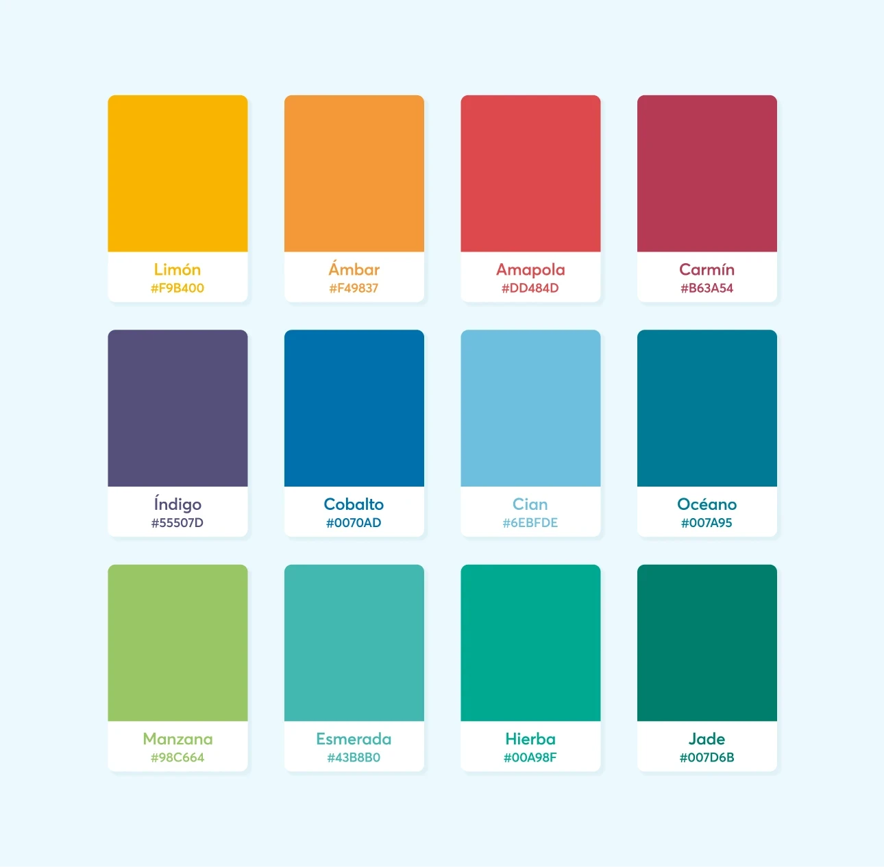
The deck is built around eleven categories: Methodology, Theory, Social Media, Search Engines, Advertising, Assets, Actions, Processes, Tools and Tech, Talent, and Metrics. The design work was in turning those categories into a visual system that scales across 152 cards without feeling repetitive.
Each family got its own colour, chosen to feel distinct at a glance but harmonious when the cards are laid out together. The palette stays bright and saturated rather than pastel, so colour can do real wayfinding work on a busy table. From across the room, you can tell which family a card belongs to without reading it.
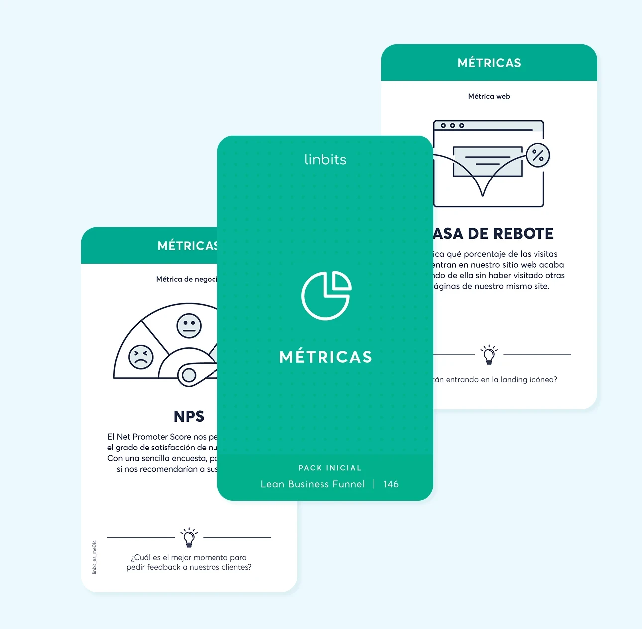
The icons are flat and geometric, drawn with a uniform stroke weight, sitting closer to the visual language of a software dashboard than an illustrated card game. That choice was about the audience. Linbits is used by founders, marketers, and strategists, people who already work daily with tools like Notion, HubSpot, or Google Analytics. The icons borrow from that world so the deck feels like an extension of the work, not a departure from it. The flat geometric system makes it feel like a tool you keep on your desk.
Each card also carries a small marker on the side showing where it fits in the funnel. A quiet bit of guidance for new users without forcing a fixed order on experienced ones.


A box that signals what's inside
The box was the first thing a user would touch, so it had to do two jobs before the cards were ever revealed. It had to set expectations for a serious working tool, and it had to feel like something worth keeping on a shelf.
I treated the packaging as part of the brand, not a container for it. The Linbits wordmark is used as a repeating pattern across the surface, turning the logo itself into the texture of the box. The result is something that reads as a designed object on its own, the kind of packaging that doesn't get thrown away after the first unboxing. Cards put back in the box stay part of the system rather than disappearing into a drawer.


A brand that holds the whole ecosystem together
Around the deck, I designed everything else the product needed to exist in the world. A wordmark that feels closer to a software product than a board game. A brand book that documents the visual identity, with guidelines for logo use, colour, typography, and the card system itself. And a set of social media templates for the launch.
The goal was a brand that could carry the methodology forward as the system grew, with room for new card categories, new editions, and new formats without losing visual coherence.
The result is a methodology you can pick up with your hands. Visual, tactile, and easy to rearrange until the strategy makes sense.


