Meet5 Premium redesign
Rethinking how Premium shows up across a social app for the over-40s, built to convert without losing their trust.

Meet5 started as a design challenge during their interview process, but it turned into a bigger question about how Premium earns its place in an app built on trust.
The brief was tight: redesign three Premium screens: the Premium card on home, the Buy Premium screen, and the Activity Detail screen. Meet5 is a social app that helps people over 40 meet new people and join group activities in their city, and Premium is how it makes money. So the ask made sense. But as I started auditing the live app, three screens stopped feeling like the real problem.
Each one was tied to something happening elsewhere. The Buy Premium screen can't fix itself if the pop-up that leads users there already confuses them. The Premium card stays inconsistent if the same idea isn't applied across home, settings, and activity detail. And the Activity Detail screen has UX problems that have nothing to do with Premium but quietly drain the conversion funnel anyway.
This disconnect, between three screens and the experience that connected them, became the real brief.
So I approached it not just as a candidate answering a prompt, but as a product designer: treating Premium as one coordinated funnel, grounding every recommendation in the app's existing behaviour, and designing for the specific needs of an audience over 40.
Everything here is my own proposal based on the live app. It's a self-directed exercise, not shipped product.
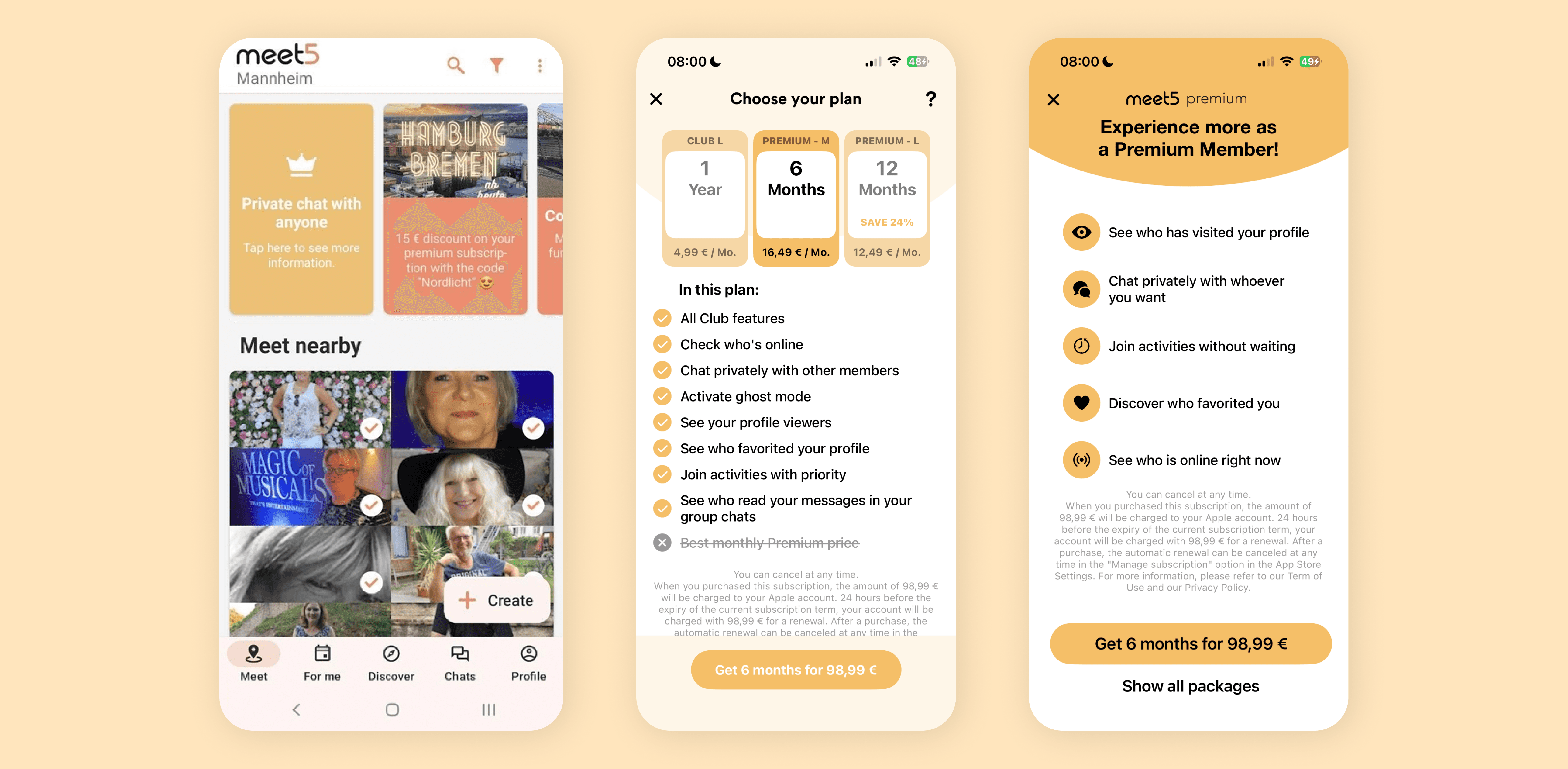
Premium in the live app today: a banner card in the feed, the Buy Premium screen, and the full-screen upsell pop-up.

The current Activity Detail screen: the map and attendees sit at the top, with the activity description and host below. The Premium prompt appears at the bottom of the "is full" state.
The audience wasn't a constraint to design around. It was the whole opportunity.
People over 40 tend to be more cautious about new platforms and less forgiving of unclear interactions. They want to know what they're signing up for, who they're meeting, and what they're paying, before they commit to any of it. And there's a practical layer underneath that: most adults in this range need reading glasses for close-up vision, and low-contrast text gets measurably harder to read with age.
A Premium experience that feels clear, honest, and considerate isn't just more accessible for them. It's the thing that makes converting them possible at all. That belief shaped every decision that followed.
A free-account audit, in light and dark mode, surfaced a handful of issues. Three of them shaped everything that followed.
Premium has signals, but no system.
The app uses crown icons, "Premium" labels, and golden accents, but no coherent identity tying them together. Premium feels like a feature toggle. The strange part: Meet5's marketing email talks about Premium more warmly than any screen inside the app. "Chat privately and connect more easily." "Join popular activities first." "See who viewed or liked your profile." Benefit-led, specific, human. Meet5 already has a voice for Premium. The product just doesn't use it.
The app's highest-intent moment leads nowhere.
When someone opens a full activity, they've shown real intent. They saw something they wanted and tapped in to learn more. And today, the screen just tells them it's closed. No waitlist. No Premium pitch tied to the moment. No similar activities. They read the screen, realise they can't join, and leave. The single strongest signal of interest in the whole app, met with a dead end.
When Meet5 asks for money, it asks badly.
Every moment that should sell Premium works against itself. The full-page pop-up fires on most session opens, so users learn to dismiss it on reflex, and its copy is generic where the marketing email's is warm and specific. The Buy Premium screen has the opposite problem: it's overloaded, trying to be feature list, tier comparison, pricing, and checkout all at once, with the most expensive plan pre-selected by default. One ask interrupts too often and says too little; the other says too much and trusts the user too little. For an audience that's already cautious about paying, both are conversion leaks.
Two more findings shaped the redesign even if they didn't lead it. The brand's coral and golden fail accessibility-contrast minimums, a real problem for a 40+ audience, which the new colour system fixes head-on. And the Activity Detail screen buries what an activity actually is beneath its map and attendee list, getting the hierarchy backwards for a screen whose whole job is helping someone decide to show up.
Every decision after this had to either support one of these, or justify breaking it.
SHOW DON'T TELL
Premium surfaces should reveal what the user would unlock, not just claim a feature exists.
DESIGNED FOR 40+, NOT DESIGNED DOWN
Larger type, higher contrast, generous targets. Not childish, not loud, just considerate.
COORDINATE THE FUNNEL
No one should feel sold to four times in one session. Every pitch shares copy, system, and pricing logic.
LOSS AVERSION, ONLY WHEN IT'S REAL
"5 people favorited you" works when 5 people actually did. If the number is zero, the card simply hides.
FORWARD LOOKING, NOT PUNITIVE
Premium should add to the experience. "Connect more easily" beats "you're missing out."
ONE DEFAULT PLAN, EVERYWHERE
If the bottom sheet promotes one price and the plan screen pre-selects another, the funnel fights itself.
This is where the project crosses from interface into product: the fix isn't a better layout, it's a feature the screen is missing.
First, the screen needed to earn attention again. I reworked its information architecture: a hero image up top for personality, social proof ("Filled up in 2 days"), the description, a host card with a personal bio quote, attendees as a horizontal strip, and the map moved further down. But the real change is at the bottom.
Instead of a dead end, the user now sees "See similar activities" as the primary action and "Join the waiting list" as the secondary one. A line of copy grounds it in something real: "2 people on the waiting list. We'll notify you in order if a spot opens." And the Premium card below borrows Meet5's own marketing voice: "Join popular activities first with Premium."
Once they join the waitlist, the screen changes again. A soft confirmation banner. A position card that reads "You're 5th in line, 4 people ahead of you." And the Premium pitch sharpens from vague to specific: "Skip ahead to 1st with Premium." The strongest moment of intent in the app now ends in a conversion, or at worst, a discovery. Both beat a wall.

Left: a typical Activity Detail when spots are still open. Middle: the redesigned "is full" state. Right: after the user joins the waitlist.
For an audience that's already cautious about paying, the fastest way to lose them is to make the choice feel like a trap.
The audit flagged the Buy Premium screen as overloaded and quietly manipulative: a cramped plan grid, a tap-to-reveal feature list nothing signals, the priciest plan pre-selected, and a wall of legal text between the features and the button. The redesign does three things: make the choice between plans clearer, make the value concrete, and make buying feel direct.
Hero benefit first.
"Meet new people and connect more easily" sets the emotional frame before any plan is chosen.
A horizontal scroll picker.
Three cards with page dots. The motion signals there's more to see, and gives each plan room to breathe.
Savings in euros, not percentages.
"Save 51 €/year" needs no math. "Save 24%" does. For this audience, the first wins every time.
Premium 6 months selected by default, not the priciest option.
The default should be what most people would freely choose.
Features split into Free vs Premium.
The change I think matters most: the user sees what Premium adds, not just the full bundle.
A plain-language CTA.
"Get Premium 6 months for 98,99 €," with a single compact line of legal copy underneath.

Left: the current Buy Premium screen. Right: the redesigned plan picker, applying the six changes above.
Meet5 was asking too often and saying too little: a pitch on nearly every session open, in copy too generic to land.
The full-page pop-up fires at most session opens, which trains users to dismiss it on reflex before they've read a word. And when they do read it, the copy is generic rather than benefit-led, nothing like the concrete, warm language Meet5 already uses in its marketing email. Add the banner on home, the card and floating crown in settings, and the Buy Premium screen (each with its own copy and visual language), and the result is frequent, scattered, and forgettable. I treated the surfaces as one coordinated system instead: fewer asks, triggered by behaviour rather than app-open, each carrying the benefit-led voice.
A bottom sheet replaces the full-page pop-up.
It sits over a dimmed feed so the user keeps their place, with the close button top-right where iOS users expect it. Two variants handle two situations: V1 fires when there's real evidence to show ("12 people viewed your profile this week," with blurred avatars as proof), and V2 falls back to a benefits list when there's no specific data to lean on. Both trigger on behaviour (after a favourite, a profile view, a chat limit) rather than on app-open frequency, and they're capped at one per session.

Left: the current full-page pop-up. Middle: the redesigned bottom sheet with V1 (specific proof). Right: V2 (benefits list).
A locked, premium-priority activity card.
A real activity, locked for a limited window, with a countdown to when it opens to everyone. It's the visible version of a promise Meet5 already makes in marketing ("join popular activities first") but never shows inside the product. The countdown turns an abstract benefit into something concrete and time-bound. It appears at most once every ten feed cards. A quieter banner also surfaces after the user scrolls past 15 activities: a signal of real engagement, not just an app open.

The locked premium-priority activity card in the feed, with the countdown to when it opens to everyone.
The same logic across the feed and activity tabs.
The system doesn't only live on the moments above. The same logic shows up wherever Premium has something to reveal: an "Online now" row on the feed where the last avatar is blurred behind a contextual upsell card; a "people favorited you this week" sheet that surfaces only when the count is real (applying Principle 04); and Visitors and Favorited tabs on Activity Detail showing blurred avatars with a real count instead of generic placeholders. Same crown, same colour rules, same voice. Different surface.


Three Home feed surfaces: the "Online now" upsell (left), the "people favorited you" sheet (middle), and a Premium-priority feed scroll with the "Get more from Meet5" inline card (right).

Left: the Visitors tab on a non-full Activity Detail. Right: the Favorited tab. Same blur treatment, same real-count logic.
Settings: one Premium signal instead of two.
The current settings page stacks a banner card and a floating crown on top of it, two signals for the same thing. I dropped the button and kept a single card between Edit Profile and Settings. And since private chat is a feature rather than user-specific data, its preview shows a real sample conversation instead of blurred placeholders.

Left: the current full-page pop-up. Middle: the redesigned bottom sheet with V1 (specific proof). Right: V2 (benefits list).
Each of these is a foundation. Together, they're a system the rest of the app can lean on.
None of the foundational pieces below were designed in isolation. They share a semantic colour logic, a single Premium identity, and rules for when and where they appear, so the three decisions land as one product surface, not three separate fixes.
An accessibility-first colour system.
The audit had flagged contrast as a real problem: Meet5's coral on white text lands at 2.41:1 and golden at 1.68:1, both well below WCAG's 4.5:1 minimum, and because Premium leans on these exact colours, the issue repeats on every upgrade surface. The fix: refined coral (#FF7F5F) and golden (#FEBC56), both paired with dark text, now 7.52:1 and 11.16:1. White text never sits on a brand colour again.
On top of that, a three-colour CTA rule that actually means something: coral for standard product actions, golden for Premium on dedicated Premium screens, and dark on soft-golden for inline Premium cards. Gold says "commit now"; dark says "here's an opportunity, in passing"; coral says "do something in Meet5." Users learn it without being taught.

Contrast checks on the current palette versus the proposed one. The colour system and the logic behind each CTA pairing.
A cohesive Premium identity.
This one emerged mid-design. The app had "Premium" labels scattered around but no actual identity, so I built a single lockup, "meet5 premium," lowercase, keeping the brand's golden "5," used consistently across bottom sheets, the plan screen, and inline cards. In tight spaces, the crown carries it alone. The crown itself became a system, not a decoration: one asset, one treatment, three sizes, no contextual swaps.
A real type scale.
The current Activity Detail screen sizes heading, body, and metadata almost the same, which makes it hard to scan, especially through reading glasses. I rebuilt the scale around hierarchy, so the eye knows what to read first.
Plan names that make sense.
Today's "Club / Premium 6 months / Premium 12 months" gives you three names for two tiers across three durations, so the relationship between plans is hard to read. I reworked it to Free, Club, Premium 6 months, Premium 1 year: same tiers, explicit durations, and a hierarchy you can take in at a glance.
The screens were always a means. The number that matters is whether more of the right people convert.
The headline metric is Premium conversion rate. The audit found two big leaks (the disruptive pop-up and the wasted "is full" moment) and the redesign goes straight at both. Around that, I'd watch plan mix (a healthier spread tells me the picker is doing its job, not just defaulting people into the priciest plan), dismissal rates across the upsell surfaces, and the brand-new waitlist completion rate, where anything above zero already beats a dead end.
What I'd test
Which hero copy converts best on the plan picker, which behaviour triggers work best for each bottom-sheet variant, and how often the locked-priority card can appear before it stops feeling rare.
How I'd listen
Five sessions with members aged 40 to 55, plus a guided walkthrough of the plan picker with new users. Knowing what works isn't enough; I'd want to know why.
I audited the whole thing from a free account, which means I never lived inside Premium itself.
I saw every upsell and the pricing screen, but not the private chats, the unlocked content, or the moments where Premium is supposed to actually pay off. Some of these recommendations would land differently for someone who's used both sides. And two of the bigger ideas, the waitlist and the locked-priority card, are genuine feature recommendations, not just design tweaks. They depend on Meet5 building the mechanics and bringing the "join first" promise into the product, not just the marketing.
Reframe the brief when it's too small
The most valuable thing I did was argue the problem wasn't three screens. Scope is a design decision too.
The brand often already has the answer
Meet5's warmest Premium voice was sitting in its own marketing email. A lot of the work was just using what was already true.
Respect is what converts
Killing the disruptive pop-up, ending the dead end, refusing to trick the buyer. It's all respect. Conversion follows from it.
For this audience, accessibility is the product
Contrast and clarity aren't compliance checkboxes here. They're the line between converting someone and losing them.


