A smarter, social way to discover and attend events in your city.

Findee started as my final project at the AllWomen UX/UI Bootcamp, but it quickly evolved into a real product exploration rooted in a recurring problem.
Living in Barcelona, I consistently ran into the same friction. Events I would have loved to attend were everywhere, but never in one place, never at the right time, and rarely easy to act on. Discovery was fragmented across platforms, information was easy to lose, and making plans required effort that often didn't match the spontaneity of the moment.
What initially felt like a personal frustration (chronic FOMO) revealed a broader behavioural pattern: people are curious and motivated to explore their city, but the current ecosystem makes it unnecessarily hard to move from "this looks interesting" to "I'm going."
This gap, between intent and action, became the foundation of Findee.
Findee is a product concept designed to make discovering things to do feel immediate, contextual, and actionable. It focuses on reducing friction across the journey: from real-time discovery, to lightweight decision-making, to seamless coordination with others.
Through this project, I approached the problem not just as a user, but as a product designer. Translating a common, emotionally resonant experience into a clear opportunity space, and designing a solution grounded in user behaviour, context, and timing.
Before moving into solutions, I focused on validating the problem and understanding its real scope.
I conducted a mixed-method research phase combining a quantitative survey with qualitative interviews, targeting people aged 20–35 who regularly go out in urban environments like Barcelona.
The goal was twofold:
Validate whether the problem extended beyond my personal experience
Uncover behaviors, needs, and pain points across the full event discovery journey
This approach allowed me to balance breadth and depth, identifying patterns at scale while also understanding the context behind them.
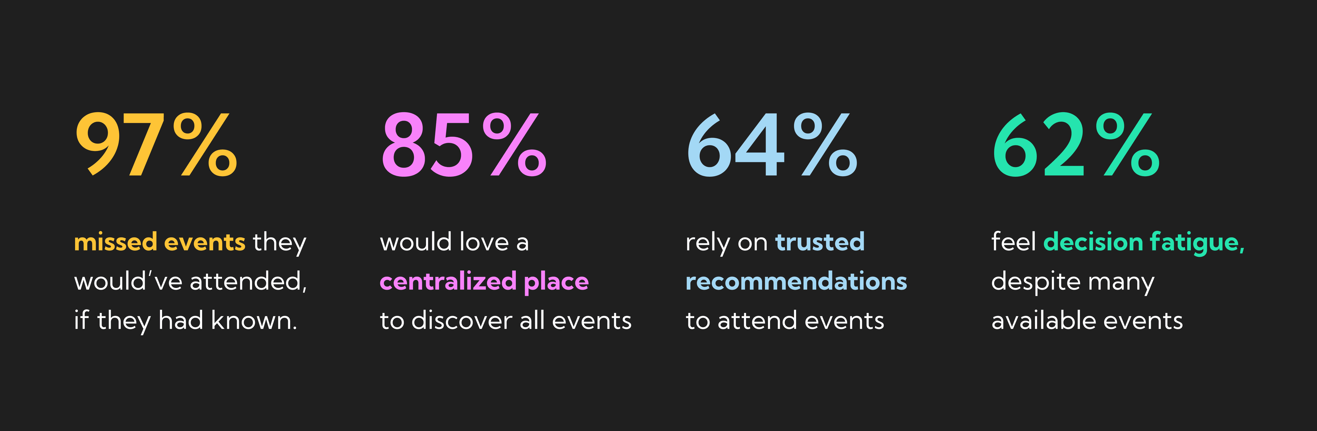

Survey results from a mixed-method research phase with people aged 20–35 in urban environments.
Three structural failure modes emerged


Two archetypes. One shared frustration.
Research revealed two distinct user types, not opposites, but a spectrum most people move between depending on the day. Both are completely underserved by existing tools.


"I believe that by creating a centralised, interest-based, and intuitive event discovery platform, for people looking for things to do, we will increase their awareness of relevant events and reduce missed opportunities."
The hypothesis became the testable bridge between what the research uncovered and what I was about to design. Every subsequent decision had to either support it or challenge it.
Research pointed clearly at three failure modes: fragmented discovery, disconnected planning, and missing social context. The design challenge was to address all three in a single, coherent product — without making it feel complex.
How might we make discovering and attending events feel effortless, relevant, and socially connected — whether for last-minute ideas or future plans?
Four primary tabs: Home, Explore, My Events, Profile. Lean navigation shallow. Every key action is reachable in two taps. The critical test: can a user find something relevant and RSVP in under 60 seconds?
I structured Findee's information architecture around three core behaviours: spontaneous discovery, active exploration, and planning. Instead of organising features in isolation, I grouped them into clear systems. Home for low-effort, real-time recommendations. Discover for map-based exploration and filtering. My Events for planning and tracking. The goal was to reduce cognitive load while ensuring users can move seamlessly from discovering events to making decisions, regardless of their initial intent.


Information architecture, organised around three core behaviours: discovery, planning, and tracking
This flow illustrates how a user finds a free music event happening now, starting from different entry points (Home or Explore) that converge into a shared discovery experience. I designed the journey around progressive intent, allowing users to first browse nearby events and then refine results using filters only when needed. The flow prioritises speed and clarity, enabling users to move from discovery to decision with minimal friction, supported by real-time context and social signals on the event page.

Core user flow for free event discovery, from entry point to attendance.
The dark UI wasn't a stylistic decision, it was a contextual one. Event apps live in the evening. Deciding what to do, getting ready, already out the door. Dark reduces eye strain in low light, makes event photography pop, and signals that the product belongs to those moments.
The colour system pairs two brand anchors, Findee Purple and Findee Green, with a saturated secondary palette used for category tags. Typography stays clean and functional, with strong hierarchy for the kind of scannable browsing the product is built for.


Brand colours, secondary palette, and typography system.
The components were designed as a system from the start, including filter pills, event cards, calendar selectors, and the sharing slider, so the product could scale to more event categories without breaking the visual language.

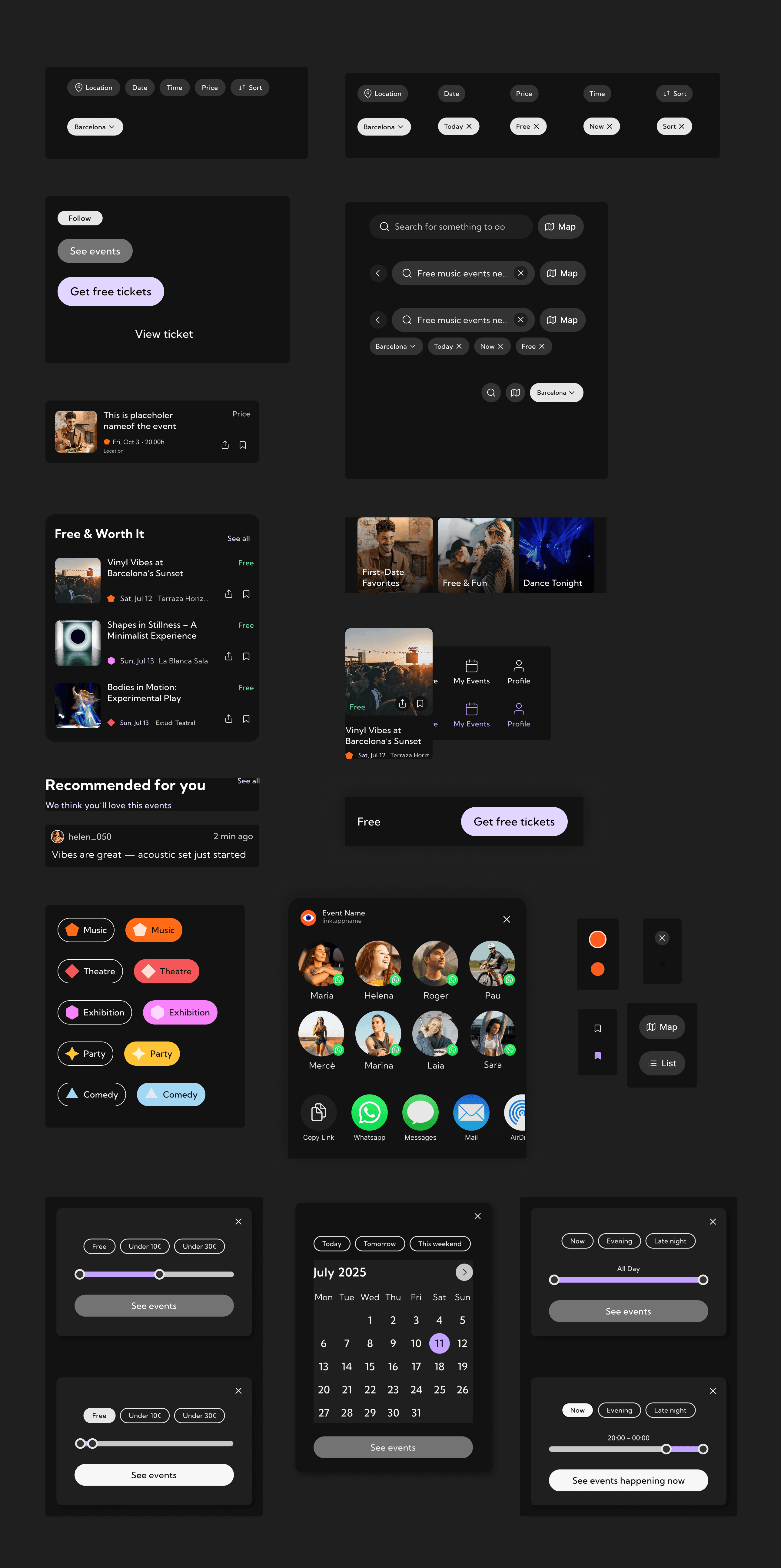
Component library, designed to scale across event types and surfaces.
Findee is built around three core ideas, each tied directly to a research finding and made visible in the UI. Below, each pillar is paired with the screens that bring it to life.
The home screen opens with Happening now as the first content block, not as a tab hidden behind navigation. Research showed 58% of users were open to in-the-moment recommendations, so the default surface had to favour the present over the future.
The filter system uses pills with category icons (Music, Party, Theatre, Exhibition) rather than a dropdown menu. Pills surface what's available at a glance and remove the extra tap needed to discover the categories.
The "See events happening now" CTA in the time picker uses a custom range slider rather than fixed presets, so users can ask for events between 20:00 and 00:00 without snapping to whole hours. The button reflects the live state of the slider, so the user always knows exactly what they're about to see.

From left: the home discovery surface, the map view with category pills, and the custom time-range picker.
64% of users said they rely on friend recommendations to decide what to attend. Your friends are going sits at the top of the home feed, above editorial content and trending lists. Social proof appears first because, in research, it was the first thing users looked for.
On the event page, the friend layer is reinforced through specific signals rather than a generic popularity score. The card shows 300 going, 120 there, 3 friends going, with a Popular now tag for events trending in real time. Each signal does a different job: trust (friends), validation (numbers), and urgency (live activity).
Below, Live updates surface comments from people already at the event. "Vibes are great, acoustic set just started." "Line's moving fast." These are not generic reviews. They're contextual, time-stamped, and useful at the moment of deciding whether to leave the house.

From left: the friends-going feed on Home, social signals on the event page, and live updates from attendees.
Rather than condensing personalisation into a single algorithmic feed, the home page breaks it into distinct surfaces, each one answering a different question the user might be holding in their head.
What's the Mood? offers curated collections (First-Date Favorites, Free & Fun, Dance Tonight) for users who know how they feel before they know what they want to do. From organisers you love surfaces new events from accounts the user already follows, which is the most reliable signal of taste in the app. Something Different deliberately introduces offbeat, under-the-radar events to keep the feed from becoming a closed loop of what the user already knows.
On the event page, More like this — Similar events nearby, happening soon turns a single point of interest into a starting point. The moment a user shows curiosity about an event, the product offers adjacent ones, so a single tap can open out into an evening's worth of options.

From left: the friends-going feed on Home, social signals on the event page, and live updates from attendees.

From left: the sticky RSVP, the post-RSVP confirmation, the two-layered share sheet, and the My Events Tab
I ran usability sessions on the high-fidelity prototype with target users. The goal wasn't to validate the visual design, it was to test whether the structural decisions actually held up. Four changes came directly out of those sessions.
The original filter system was layered and required multiple taps to combine categories. Users got lost. I flattened the structure so filters could be combined inline, with the active state visible at all times.
A few labels and CTAs were ambiguous in testing. Users hesitated before tapping because they weren't sure what would happen next. Rewrote them to be specific and verb-led, e.g. "See events happening now" instead of "Search."
Users didn't realise they could switch between map and list, or didn't notice the toggle. Repositioned and re-styled the toggle so the available view is obvious from the moment the page loads.
The RSVP action lived too far down the event page, and users were dropping off before reaching it. Pulled the primary CTA up alongside the event title so the action is reachable without scrolling.
Solve a problem you feel
It fuels empathy and an obsession with the small details. When you've lived the problem, you notice the things a brief never lists.
Design for reality
People are forgetful, distracted, and spontaneous. A good product accounts for that instead of fighting it.
Testing beats guessing
The best feedback came from real people using the prototype, not from internal logic or assumptions.
A good product gets people to go
Discovery is the easy part. Closing the gap between seeing something and showing up is the real design problem.


