Brand identity for a home decor line by a technical textile manufacturer

A technical fabrics company, learning to talk about feelings
Bliss is the home decor brand created by Citel, a manufacturer specialised in technical performance fabrics. The launch was a move from B2B into B2C: Citel knew how to make exceptional materials for hotels, offices, and contract interiors, but Bliss needed to speak to a different kind of customer, one who buys curtains because of how they make a room feel, not because of their fire-retardant rating.
I worked on the brand from the ground up, contributing to both the strategy and the visual identity.
Two audiences, one brand
Before any visual work, we mapped out what Bliss needed to mean. Citel sells to architects, hoteliers, and contract buyers who care about specifications. Bliss sells to homeowners and interior stylists who care about how a space feels. The brand had to land for both. Warm enough for the second audience to want it in their home, technical enough for the first audience to keep trusting the materials behind it.
A wordmark built from simple shapes
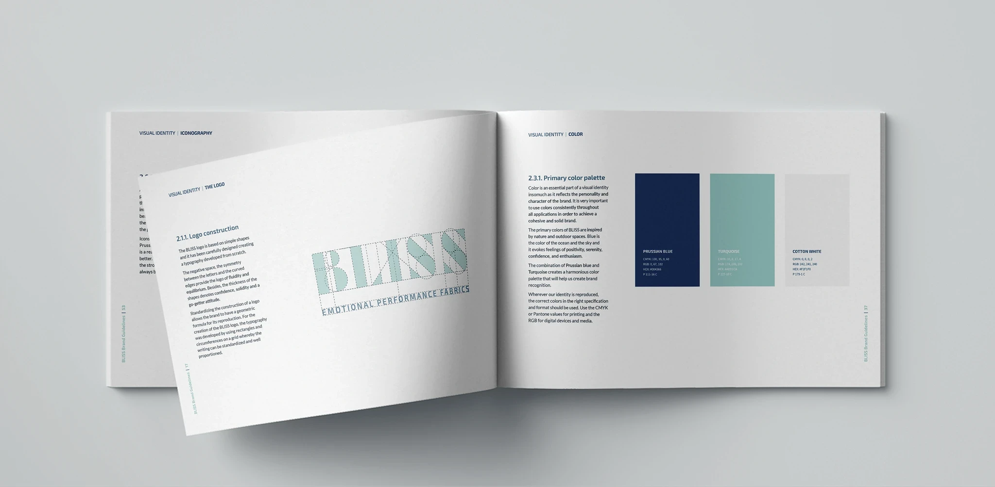
The logotype is a custom letterform built from a small set of geometric shapes. Each letter is constructed rather than drawn. Rectangles, arcs, and angled cuts that lock together to form the word. The stencil-style negative space inside the letters keeps the mark feeling open and contemporary, while the heavy geometry gives it the weight of a serious brand.
The idea reflects how Citel works. They take something simple, like thread, and combine it into something more. The wordmark does the same in another medium.

Engineering credibility, emotional language
Citel's strength is technical: high-performance fibres, durability, certifications. Bliss had to keep that credibility while building a language that speaks to mood, light, and atmosphere, the things people actually choose home textiles for. The tagline that emerged from the strategy, Emotional Performance Fabrics, holds those two ideas in tension on purpose. The design work was about making that tension feel natural rather than forced.


Built for catalogues, not screens
The visual system leans into the dual identity. A palette of dusty teals, deep navy, and warm off-whites keeps the mood soft and residential, while a set of utilitarian icons handles the technical communication. Performance properties, certifications, care instructions, all delivered without breaking the calm tone.
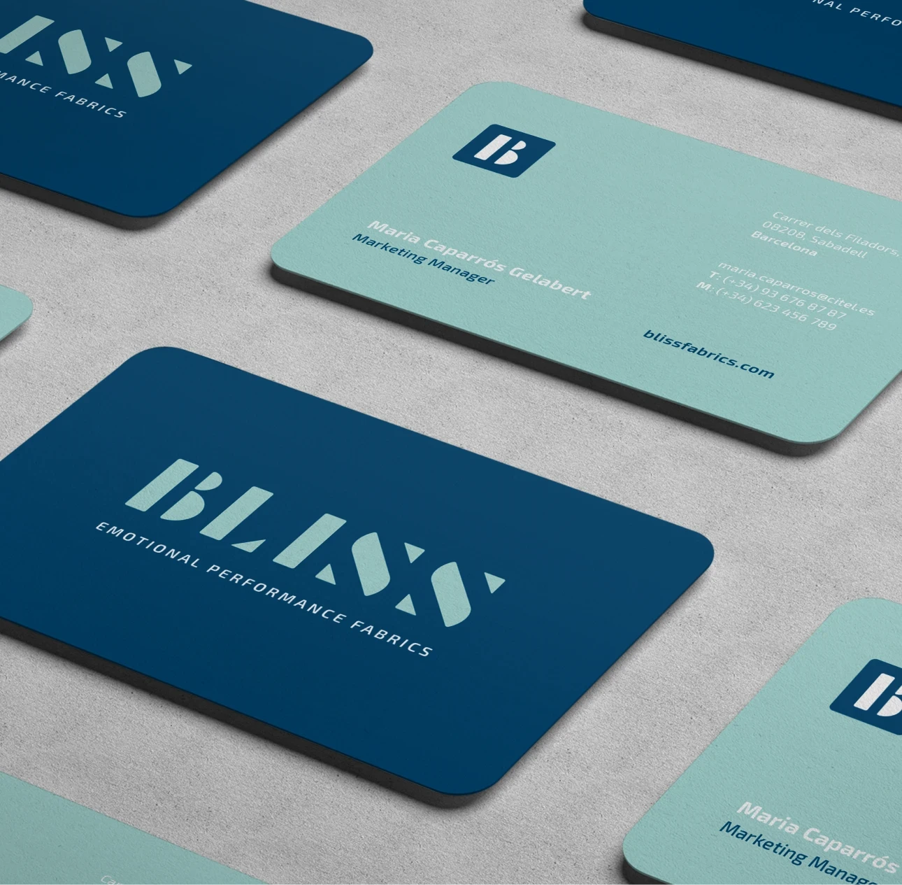
The brand was designed for print first. Brochures, sample catalogues, business cards, stationery, and a full presentation system. Every application was treated as part of the same family, so a Bliss spec sheet and a Bliss lookbook feel like the same brand seen from different angles.
A brand that lets a technical company speak in a softer voice, without losing what made it trusted in the first place.


